Visual identity redesign for Esfera Ingeniería, a Valencian engineering firm.
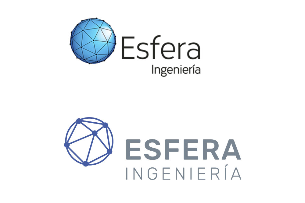
The company needed an update to its visual identity without losing its original spirit. The brand was therefore redesigned with a complete change in color and typography.
The previous pure cyan blue, which had long been associated with technology and digitalization, was replaced by a deeper, more elegant shade of blue. This was paired with a neutral grey for the typography, and in some applications, silver ink was proposed. The resulting color combination better aligns with the type of products the company manufactures and conveys the image of a serious, well-established brand in the sector.
In addition, the symbol was simplified to maintain the brand’s essence while clearly showcasing its evolution.
Project completed in 2022.
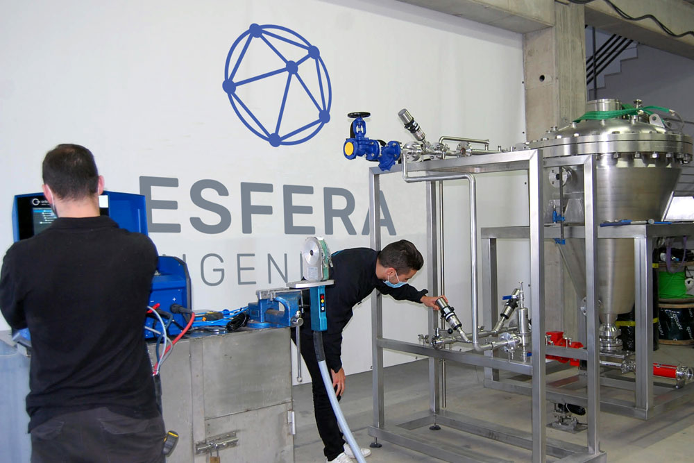
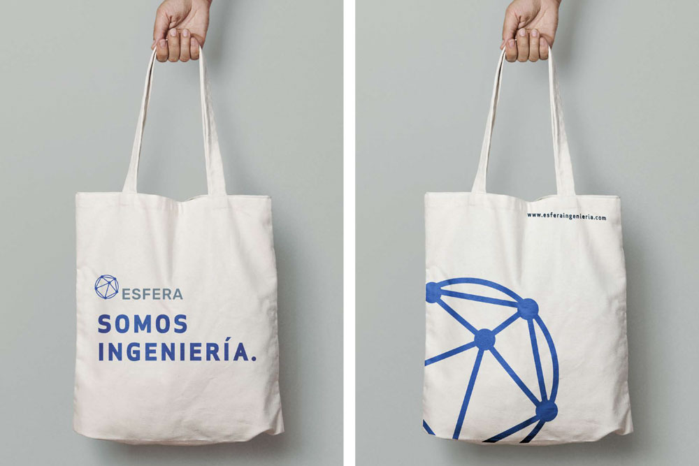
Visual applications shown here were developed by designer Gloria Martínez Capuz, who was then part of the Más Creativas team. Factory photo source: valenciaplaza.com
Client: Más Creativas Agency for Esfera Ingeniería